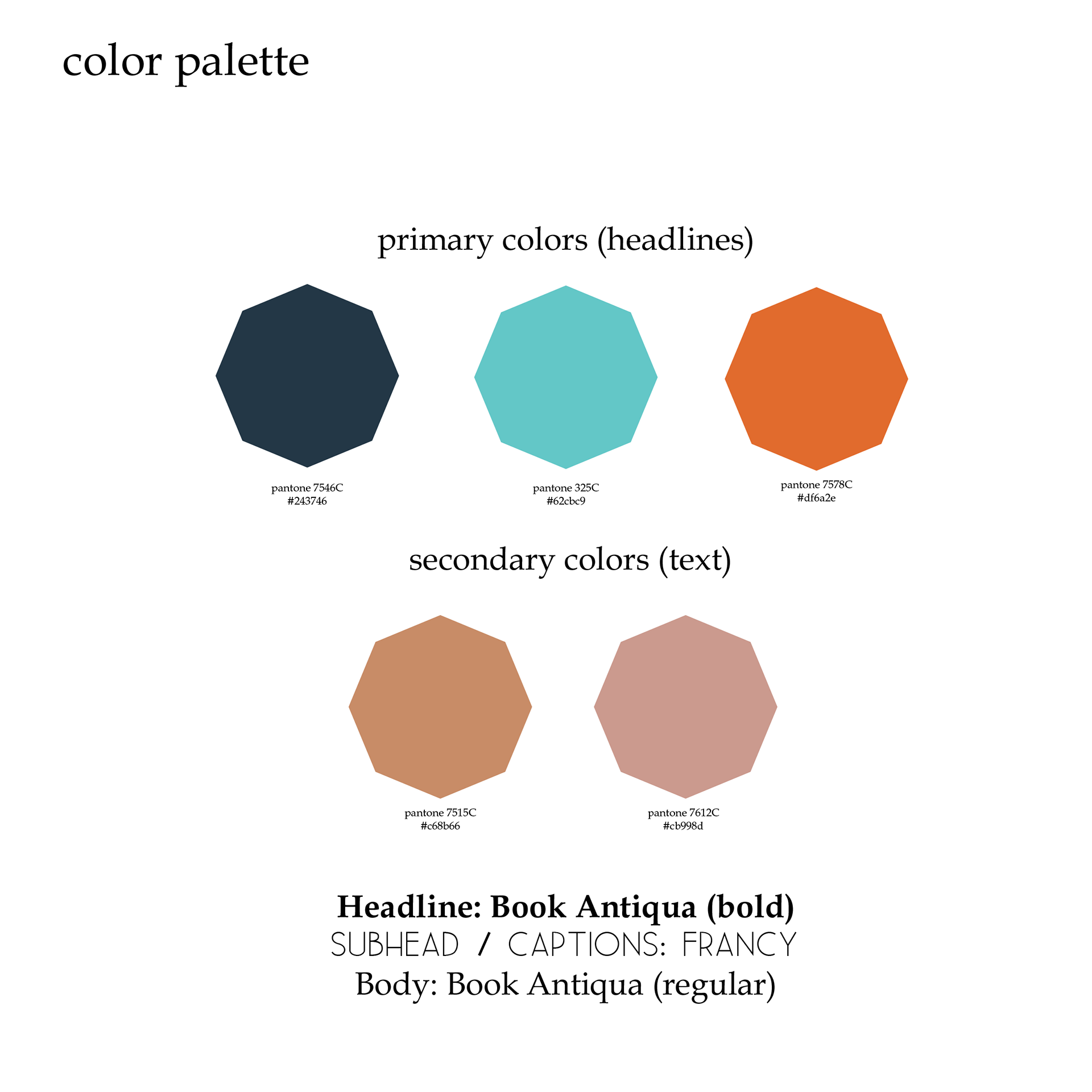
Oak Rose Group is a strategy and consulting firm located in Arizona started by a colleague of mine. The firm specializes in strategy to clients who have a goal of promoting researched and proven ideas by connecting them to leaders who can help them scale or enact them into legislation. The group wanted to convey visually through their logo that they specialize in convening, connecting and offering creative problem-solving with strength and grace. This is where my part came in. We settled on an icon that reflected both an oak tree for wisdom and grace of a rose. The octagon came into play because historically it is a shape that is used in very high end brands and a little more unique than just a circle. The octagon visually added to the three key points that ORG wanted to convey with her mark: convening (the shape draws your eye into the tree and out), connecting (all points and lines in the logo are connected) and creating (the shape and lines are a nod to Da Vinci's Vitruvian Man which to me is a symbol of nature and creativity). The colors were pulled from the beautiful sunsets that you can find only in Arizona. All together this is mark that is uniquely theirs.
